Posts

Showing posts from February, 2012

Graph of the week: money multiplier

Image
So the M1 multiplier for the US is still below 1: Source: St. Louis FED, FRED database What does this mean? Essentially it means that every dollar created by the FED (an increase in the monetary base M0) will result in a <1 dollar increase of the money supply (M1), as is evident from the figure below. So, the credit and deposit creation of commercial banks is limited in this case. The banks are still holding on to a lot of excess reserves.  M0 (St.Louis adjusted, green) and M1 (red) are both on the right scale. Source: St. Louis FED,  FRED database The effect of a 0<m<1 multiplier is that the monetary base is larger than the M1 money supply (remember that M1 doesn't take into account savings deposits or time deposits, which are included in the M2). This kind of a situation is obviously not good, as there is more money in the economy created by the central bank than it is created by commercial banks. One could say this is a clear exa...
Imported instability: examining the causes of eurozone contagion

Image
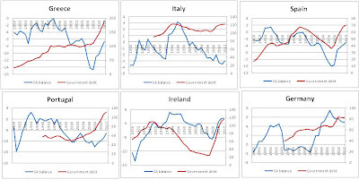
Note: this article is an update and summary of the sovereign eurozone debt crisis page . I've added a few things and broadened the analysis. In light of the expansionary austerity debate in peripheral Eurozone, the conventional solution surrounding Eurozone’s recovery has been a call for fiscal adjustment. The idea supporting austerity arises from the viewpoint of recklessness of peripheral Eurozone governments and their extensive debt accumulation and crippling welfare states. Even though a certain level of fiscal profligacy and strong accumulation of debt were apparent in peripheral Eurozone (and it is certainly the main issue holding back its recovery), this was hardly the most important reason behind a strong and severe recession that struck these countries. The focus of the article will be on the spread of financial contagion onto the peripheral Eurozone economies, namely Greece, Portugal, Ireland, Italy and Spain.  The problems that occurred for the peripheral Eurozon...

UK recovery policy – Austerity! What austerity?

Image
Note:  This blog post was also published at the  Adam Smith Institute blog  (1st March 2012). For all my other ASI writings see  here .  Recently a lot of attention has been given to the case against British austerity. It has been blamed for the inability of the UK economy to pull itself out of border-line recession.  Krugman , DeLong , Baker and many others attack it claiming that contractionary expansion makes no sense, while on the other hand Sumner  and  Boudreaux tend to overturn the argument by claiming there is no austerity in the UK. And opposing to both of these views, UK Chancellor George Osborne surprisingly claims it is working.  Who is right? Well, one thing is certain, Britain isn't experiencing any form of robust economic growth , so whatever policy is done by the government clearly isn't working.  The UK government is leading an ambiguous recovery policy which is, unsurprisingly, producing ambiguous results. ...

US debt and deficit - graph of the week

Image
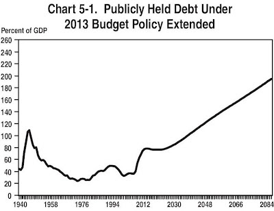
From the latest US budget proposal, I found an interesting graph that was given attention to in Congress . Source: US President's Budget for Fiscal Year 2013.  Analytical Perspectives , pp. 58  It describes a long term fiscal challenge facing America, where the current administration (led by the Treasury secretary Mr Geithner) stresses the importance on short-term deficit control and debt reduction, something vehemently opposed by Paul Krugman .  The idea is to decrease the short term deficit and decrease the growth rate of the public debt by the end of the decade. The deficit is projected to be around 2.8% of the GDP by 2019, which is a goal within reach. "Beyond 2022, however, the fiscal position gradually deteriorates mainly because of the aging of the population and the high continuing cost of the Government’s health programs." Analytical Perspectives, US Budget (February 2012), pp.58 These expected costs will drive up the deficit and cause a h...

Effectiveness of credit targets

Image
Note: this blog post was first published at and intended for the Adam Smith Institute blog , on Friday, 17/02/2012, entitled "The fallacy of Project Merlin" Project Merlin – the idea that the UK Treasury can centrally plan the amount of credit needed in the real economy – was a predestined failure. The recent data released by the Bank of England was disappointing for the UK SMEs. The lending target fell short by £1bn, even though total lending did rise to overshoot its target by £25bn. The banks claim they did their job as required, while accusing the sluggish economic recovery and poor demand for credit from small businesses as the reason behind lower SME loans. On the other hand, SMEs blame high credit costs and unfavourable loan terms, calling for more competition between the banks to offer better products and lending models.  The reaction from both sides, the banks and the businesses, was as expected, proving once again the short-sightedness of politician...

Business and consumer confidence

Image
Business cycle tracking series Continuing with the business cycle tracking analysis, I will take a brief look at the business and consumer confidence indicators for selected countries. I will observe the OECD indicators of business and consumer confidence to verify their total effect on predicting the recovery. First up is business confidence . Source of data: OECD Main economic indicators database As can be seen on the graphs, business confidence was severely struck during the last adverse shock, even though the data seem to show the deterioration of business confidence started earlier last year, which is probably due to uncertain expectations on the development of the recovery. Even though policy uncertainty culminated in August 2011 with the debt ceiling argument in the US Congress and the eurozone situation, business confidence simply followed down that same trend in Europe, while recovering in the US following a shift of the debate toward electoral topics and p...

Business cycle tracking - Europe

Image
The series of business tracking continues with observing the development of the cycle in the eurozone and in the UK. The analysis will constrain itself only on observing the leading indicators from the  OECD database  and the Conference Board . The first is the leading indicator for eurozone from the Conference Board. They compare the LEI with a coincident economic index and the quarterly RGDP growth rate. Source: The Conference Board, Global indicators, Euro Area What can be noticed is a small increase of the index in December 2011 (which is the last available data), offering a slightly better perspective for the eurozone after the latest fiscal treaty conference in December and signs of reforms in Italy and Spain. However, it is still ambigous to conclude whether the index itself will show a rising signal for the rest of the year, or whether the bottom of the possible 'double dip' has been reached.  The index comprises of the following indicators...

Policy uncertainty - graph of the week

Image
In today's VoxEU set of most recent articles, I ran into a very interesting one measuring economic policy uncertainty in the US as a way to explain the trails of the current recovery.  Source: Baker, Bloom, Davis (2012) "Has Economic Uncertainty Hampered the Recovery" Baker, Bloom and Davis (first two from Stanford, the third from Chicago) devised an economic policy uncertainty index based on three types of information: "frequency of newspaper articles referencing economic uncertainty and the role of policy, federal tax code provisions set to expire soon and the disagreement among forecasters on future inflation and future government spending." They have the index database, as well as their results and methodology explained on their webpage and this short  paper  for the Hoover Institution Press. Here's a good summary of what they're trying to say: "We previously argued that policy uncertainty was a key factor stalling the recovery. W...

Graph(s) of the week: velocity of money

Image
Still on the US business cycle , here is the look at some monetary indicators. The first graph depicts the velocity of money (V in the famous quantitative theory of money equation MV=PQ) and the employment-population ratio (employment adjusted for the discouraged workforce - the most precise unemployment indicator):  Source: St. Louis Fed database ( FRED ) The natural log of M2 velocity is depicted on the left scale (blue), while the log of the E-P ratio is on the right scale (red). The correlation is obvious and can be explained in the following way: the velocity of money measures the rate of circulation of money in the economy, i.e. the rate at which goods and services are bought. So it makes sense that with decreasing levels of employment and decreasing consumer confidence (as seen in the previous post ), the rate of money used to buy goods or services will decrease. And since the E-P ratio still isn't showing any signs of improvement (even with the latest jobs report )...

Business cycle tracking - USA

Image
This is a beginning of a series of quarterly (or half-year) posts on the business cycle conditions of some of the selected world economies. I aim to observe and analyze certain leading business cycle indicators to try and show where the current recovery stands. Even though observing these indicators doesn't necessarily imply a move of the entire variable in that direction, the leading indicators can prove to be good signal of upcoming economic behaviour.  The analysis will be simple in the beginning, and will add observations and indicators along the way, all in hope of creating a better picture of when the recovery might end, and the period of economic prosperity begin. The series itself will probably be presented in a separate page on the blog, where up to date data on selected indicators and economies will be available. I will provide summaries as a blog post by the end of each quarter to show the direction of the recovery. In orde...