Posts

Showing posts with the label Graph of the Week

We called it! How we predicted a Trump victory with amazing precision

Image
First of all apologies to my regular readers for not presenting our results here sooner. It's been overwhelming in the past two days - first with the prediction, then with the results, and then with the post-election frenzy.  Anyway, we gave an almost perfect prediction ! Not just a Trump victory, but also all the key swing states (PA, FL, NC, OH), and even that Hillary could get more votes but lose the electoral college vote. Here are our results as I presented them in a Facebook post on the eve of the election: For a more detailed explanation read our blog . The method is described there in greater detail, plus we call all the states. The story got covered first by the academic sources. My own University of Oxford published it as part of their main election coverage , as did my alma mater, LSE on their EUROPP blog . More news coverage soon to come! Details of our prediction  The results nevertheless came as an absolute shock to many, but it was...

Graph of the week: Immigration: perception vs reality

Image
An interesting chart from the Economist about the perception and reality on the total number of Muslims in European countries. It's striking how big the overestimation gap is in the selected countries (do have in mind that these are the official figures; perhaps there are undocumented Muslim immigrants that increase the actual numbers, but I sincerely doubt that the real numbers are anywhere near the perception).  The Economist So why is there such a huge overestimation (between 3 to 8 times!) in Europe about the total number of Muslim population in their countries? In general, the anti-immigration sentiment rests on the same concept: that there are too many immigrants (many of which without any legal documents), "taking our jobs". The perception on the total number of minority immigrants in Western countries is very similar to this one from above . Their numbers are vastly overestimated.  Perhaps the reason for this is that minority immigrants tend to cluster...

Graph of the year: The Fed increases interest rates!

Image
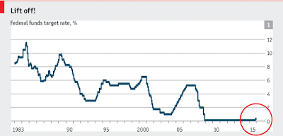
It has happened. The Fed has raised short-term interest rates for the first time since the start of the financial crisis in 2008. And immediately they've doubled it! The rate went up from 0.25% to 0.5%, with a pledge to be gradually increased further in the years to come. In Janet Yellen's own words: "This marks and end to an extraordinary seven year period."  Source:  The Economist An increase of interest rates in theory implies several things. Central banks increase interest rates when they want to curb the expansion of the economy, or in other words to prevent its overheating. A quarter of a basis point increase hardly means the US economy is overheating, but in the wake of the liquidity trap during the crisis and the recovery, and particularly Fed's  September 2012 announcement  that it will purchase mortgage securities as long as it takes until the labor market "improves", this move is viewed as a careful and gradual "return to normal...

Graph of the week: Happy, happy Europe

Image
From the Economist , calling upon a report from Eurostat: what drives happiness in Europe and how heterogeneous European countries tend to be when it comes to the satisfaction with their living standards.  Source: The Economist "ONE frequent stumbling block for the European project is the fact that different countries want different things. Recent Eurostat polling on self-reported happiness highlights those divergences. As usual, Scandinavians are the happiest people in Europe and retired Danish women are the cheeriest among them, reporting a happiness score of 8.5 out of 10. In general, geography is the best predictor of merriness, followed by pay. At all income levels a step up one quintile on the income scale makes people more content. Yet the poorest 20% of Danes are more joyful than the richest Greeks." Bear in mind that the data on happiness is self-reported, which can make it a bit biased. However, even with all the problems of self-reported survey data, the ...

Graph of the week: A country divided

Image
This weekend Germans celebrated the 25th anniversary of the fall of the Berlin Wall. A symbolic event that represented the end of an era (both the Cold War and communism in Eastern Europe were finally over); followed by a stream of euphoria and triumphalism from all sides. Looking back, 25 years later, some might say that the euphoria was misplaced: the world yet again resembles a Cold War status quo, where old foes are once again flexing their muscles in foreign territories. On the economic side, some Eastern European countries are arguably better off than before, while others remain in shambles of a failed transition.  In Germany, at first sight the convergence wasn't as successful as initially hoped. 25 years later the western Germans are still living better than their eastern compatriots. GDP p/c in east Germany is still 2/3 of that in the west, unemployment is higher, its demographics is worse, and net migration is still positive from east to west, leaving many eastern ...

"The state of humanity is improving"

Image
In my previous blog post I called upon some of the evidence from a very interesting website called  Human Progress . Once you go to their website the first thing that welcomes you is the sentence from the title. So let's look at the evidence to evaluate is this really so:  Before you do, have in mind that I'm looking at aggregate numbers and trends of some of the main development indicators of human progress in (mostly) developing nations.  1. Poverty is declining worldwide  Looking at the four chosen regions, all of them are experiencing a decline in the headcount of people living below $1.25 a day (adjusted for inflation and PPP, and in relative terms). This is particularly obvious for East Asia (the orange line), and in general for all low and middle income countries (light blue line). Even though this hardly suggests that their living standards are now better, the process of globalization and rapid growth of international trade in the past 30 years ...

Is the World a safer place?

Image
A bit of international relations and foreign policy this time (a slight digression from economics). Consider the following recent events: A passenger flight  gets shot down by a surface-to-air missile in the middle of Ukraine by pro-Russian separatists amid growing concern and discontent over the country's future. The global superpowers have been flexing their muscles over Ukraine far too long without any positive solution near the horizon. The EU and US are blaming and sanctioning Putin, with further frictions bound to happen. Israel is issuing a full-blown attack on Gaza aimed at destroying the Palestinian terrorist group Hamas, with again hundreds of civilians being killed in rampant bombings . Israel seeks to destroy underground Gaza tunnels , frequently used by Hamas for terrorist attacks. Almost 90% of Israelis support the attacks. The situation in Syria is still far from being resolved, Iraq and Afghanistan are in shambles for the past 10 years, Iran's nuclea...

Graph of the week: The misery index

Image
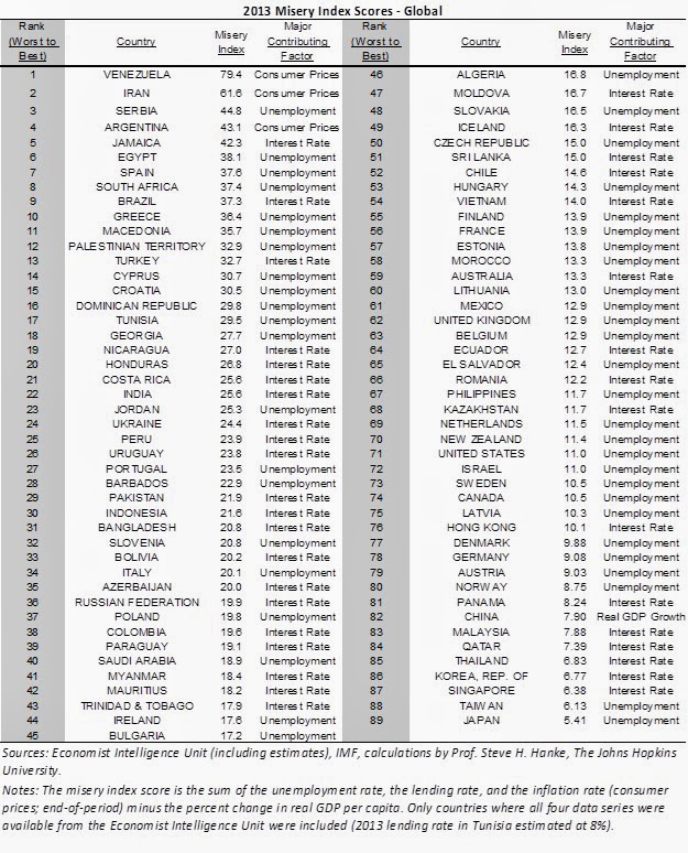
Recently I came across a new interesting index  of economic development measuring the opposite of the usual wealth, prosperity, happiness and income p/c. This one ranks countries in reverse order, it measures their relative "misery" with respect to their unemployment situation, inflation and bank lending - so all the stuff that makes people poor and hence miserable.   Steve Hanke of the Cato Institute  and John Hopkins University, used the data from the Economist Intelligence Unit ranking 89 countries. He applies a very simple methodology: sum of inflation, bank lending and unemployment rates minus year-by-year per capita GDP growth (so as to offset the temporary negative effects of the former variables). He got the intuition from Arthur Okun and Robert Barro who used things like inflation, unemployment and government bond yields to measure relative misery levels in the US during different Presidential administrations. The first apparent criticism to such an approa...

Graph of the week: World Cup fever

Image
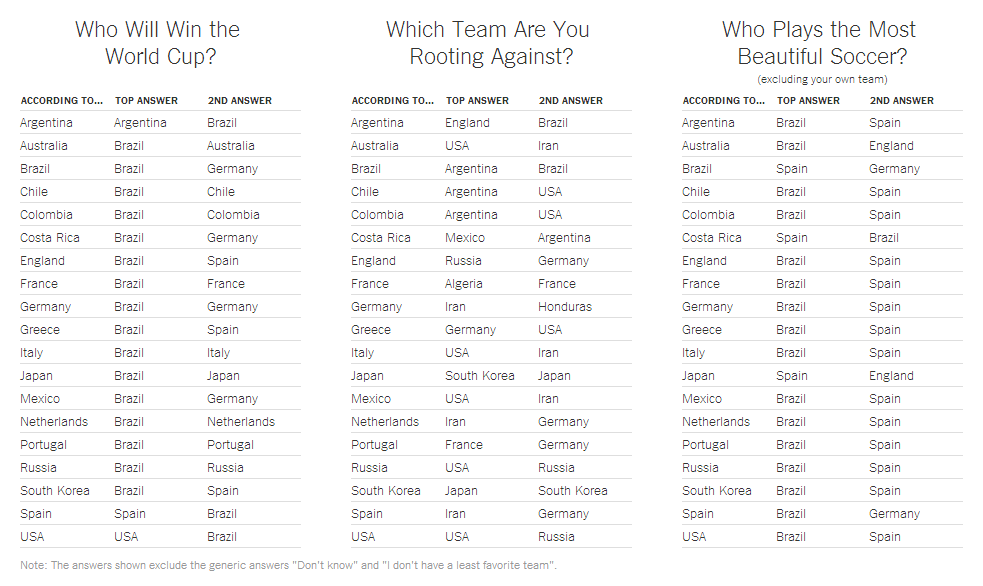
The football World Cup is at our doorsteps and the fever is certainly there, at least in the nations which have qualified. So I think it's only appropriate to follow this up with a quick post - don't forget that the football World Cup is the most viewed sporting event in the world (yes, even more than the Olympics and the Super Bowl). Perhaps a more interesting economics-based introduction to the WC2014 would be to talk about the money revolving around the event, or the vast infrastructure spending done by the Brazilian government that triggered country-wide protests that still threaten to undermine the event (even though they would certainly be justified as the amount of potential corruption arising from all those infrastructure projects is massive), or even to discuss the likelihood of winning with respect to a whole variety of factors (FYI, the Economist has already done a very interesting estimation of the winning probabilities). What caught my attention was a study ...

Graph of the week: "Academic" salaries

Image
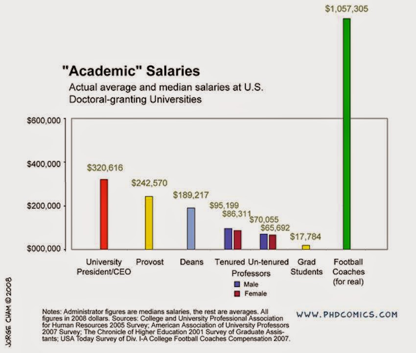
Well this is interesting: Source It seems the best job you can get at a University is that of a football coach. Not only do you massively outperform the tenured professors, but you also outperform the deans and the university president. How can this be? Is this fair? Is it fair for a football coach to get a higher salary than highly-respected academics and even their own bosses? Yes, it is. It's all about supply and demand. Fairness has nothing to do with it. There is a lack of supply of high quality coaches (and high quality players in general, in any sport). If one wants a good result which is usually accompanied by a large amount of money flowing in to the winning team (e.g. in terms of sponsorship deals) then one needs to pay the price for such quality. In college sports the players are cheap - they're students after all so they get scholarships , but that's why a coach must be expensive.  A football coach with a good performing team brings in a lot of ...

Graph of the week: Correlation doesn't imply causality vol. 2

Image
Or Which is more important in competitive sports, money or talent? The Economist once again paired an interesting relationship which could be suspect to the most obvious mistake in social sciences - interpreting correlation as potential causality. As I've pointed out in my earlier text on a similar topic linking wine consumption and academic performance , just because we inferred a pattern in the data doesn't mean that there is an actual causal link between the two observed variables.  This time they look at the English Barclays Premier League (BPL) and compare club performance in the league (points) for the past 20 years with the money spent on player wages as a percentage of the season's median. Basically the question is how much does money matter?  Source: The Economist According to the graph above it seems that it matters a lot. The more money the club spent on player wages, the higher, on average, the points they gain by the end of the season and hence the...