Posts

Showing posts from August, 2012

On central planning

Note: This article was also published on the Adam Smith Institute blog , on 3rd September 2012. For all my other ASI writings see here . My two favourite political economists, Daron Acemoglu and James Robinson, have started (and ended with) a series of blogs on the topic of central planning . Their angle is that central planning in practice doesn’t originate from Marxist ideology, but from the inherent desire of an extractive state to exert full control over its people. They were motivated to engage into the subject in order to disprove the idea that ideology is what causes economic inefficiency (they spend a lot of time in their book tackling this subject – the book is reviewed here ).  This is similar to another argument they aim to disprove, which claims that poor countries are poor because their leaders are ignorant and chose inefficient systems since they either don’t know better, or are blinded by ideology. And while a lack of knowledge and/or ideology is an attrac...

Is there such a thing as an Austro-Keynesian?

Arnold Kling has ended his blogging days recently , and from now on he will just be writing in essay format. Too bad, cause I really enjoyed his wit and brilliance at EconLog . We will still have a chance to read his intuitive pieces, best of which in my opinion are his articles on the " Patterns of Sustainable Trade and Specialization ", and his inspiring book on Economics 2.0, entitled " From Poverty to Prosperity " (co authored with Nick Schulz). All of his research can be found here . In light of this news, I bring forward a following quote from Prof. Kling, from a couple of weeks ago, referring to his long sought idea of calling himself an Austro-Keynesian : "About four years ago, I described myself as an Austro-Keynesian . Recently, I have been asked about that concept. One way to put it is that I accept and reject some major tenets of each camp. From the Keynes camp, I accept the view that financial market psychology is variable (animal s...

Graph of the week: who really gained from the euro?

Image
Back to the Eurozone briefly with the following graph found on FT's Alphaville last week, taken from a recent study done by the UBS. They try to find out who has benefited the most over the past decade from the euro, and a unlikely conclusion emerges – the peripheral economies experienced (in most cases) rapid increases in personal incomes, while the so-called core countries mostly lost out. (Click on graph to enlarge) Source: FT Alphavile  ( taken from a report by the UBS ) Each country’s individual graph depicts income distribution within a country based on 10 grades of disposable income, aligned from left (the bottom decile) to right (the highest income decile).  Several interesting conclusions arise. First the authors point out that in the "core" countries the poor got poorer while the rich got richer. This is evident in the cases Germany, Austria, Holland, and significantly in Belgium (a close to 50% drop in income in a decade!). In France it was the ...

On budget plans

Image
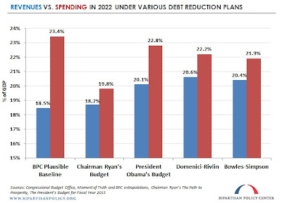
I already covered the Ryan budget proposal back in March , calling it hypocritical and in certain parts unrealistic. I praised some aspects of his taxation reform proposals, but I didn’t approve of his expenditure side reforms, particularly concerning defence spending, and have fully aligned with what Ron Paul had to say on the Ryan budget, calling it disappointing in which it continues to assume that “the federal government should [more or less] continue to do everything it is currently doing”, and that Congress should learn to “stop trying to run the world, run the economy and run our lives”. Five months later the Ryan budget is again the focal point of attention due to Paul Ryan's nomination for Vice President by Mitt Romney, the Republican challenger to President Obama in the 2012 US Presidential elections. This resulted in many economists and political commentators having once again repeated their main points from five months ago on what this budget can and cannot do. And s...

Social transfers and the welfare state

Image
The points made in the previous post  on net contributions paid and entitlements received got me thinking on the whole debate regarding transfers and their outburst during the recent crisis. As the quote from Makiw has shown, accounting for net transfers while calculating the progressiveness of the tax system paints a more precise picture of the US redistribution of income (amid all the controversies over how those numbers were calculated). Even though the number for transfers to the bottom quintile group is biased upwards, it is still nonetheless true that on average lowest quintile groups receive more from the government than what they contribute to. And this is fair in some instances where people are disabled or for other reasons unable to work (retired or children). But the escalation of transfer payments towards a rising 'army' of unemployed can have negative long-term consequences as well.  The following graph shows an e...

Two points on taxes

They’re not all that recent but can come in handy any time. The first one is on the progressivity of taxes and transfers, while the second one is on the morality of tax evasion. A well informed reader would probably guess instantly (based on the vividness of the ongoing debates) that the first one is concerning the US, while the second one is concerning the UK. And he or she would be right.  A post by Gerg Mankiw a month ago introduced a different perspective on the unfair income tax debate. It shifted the attention from low taxes on the 1% of high income earners to the high transfers received by the rest of the public. He got the numbers from a recent CBO report on the distribution of income and taxes.  "Because transfer payments are...the opposite of taxes, it makes sense to look not just at taxes paid, but at taxes paid minus transfers received. For 2009...here are taxes less transfers as a percentage of market income (income that households earned fro...

Tracking the recovery (2) – business and consumer confidence

Image
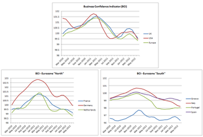
Continuing with the Recovery Tracking series after a brief graph of the week pause, we look at business and consumer confidence in the US, UK and Eurozone, comparing them to the situation from 6 months ago . The OECD once again offers a good database of tracking these indicators, in particular the Business Confidence Indicator (BCI) and the Consumer Confidence Indicator (CCI).  Business confidence Source: OECD Standardized Confidence Indicators . Latest data available for June 2012. Click on graph to enlarge.  I've limited the data to start from May 2010 to focus only on the recent shock in confidence experienced in 2011. Looking at the US and the UK in the first graph, a shy recovery from January onwards was soon brought to an abrupt end around April. This is something that the leading indicators failed to take account of. The reason is the faster reaction rate of business (and consumer) confidence indicators to a series of bad news that surrounds the...

Graph of the week: 150 years of bond yields

Image
This week's graph offers several interesting facts to ponder upon: (click to enlarge) Source: The Economist , July 2012 It seems that high spikes in bond yields were a natural occurrence in the 70s and the 80s during times of high inflation. Even in the 90s, average US and German bond yields were still higher than what Spain and Italy have today. And it was interestingly in the beginning of the 90s that Spain and Italy started to diverge against US and German yields just as they are doing today. The convergence came soon enough, or to be more precise, a bit before adopting the euro and agreeing to the necessary convergence conditions .  However, the divergence of today is really simple to explain. It’s all a question of risk perception of investors where bonds of countries like USA, Germany or the UK (not pictured), no matter how bad their fiscal position is and no matter what the rating agencies say, are still regarded as ultra safe investments. On the other hand,...