Posts

Showing posts from April, 2014

Week links (6)

Image
Another edition of some of the finest texts in the blogosphere for the past week or so: 1. "Australian PM makes pitch for budget cuts" , Wall Street Journal . Finally a Prime Minister with some sense: “This will not be a budget for the rich or the poor ... This will be a nation-building budget, even though it cuts spending, because you can’t build a nation spending money you don’t have and that’s more than you need to borrow.” And this all despite the fact that Australia's budget deficit is far lower than that of the US and most European countries (down at 1.9% of GDP), plus their debt is among the lowest in the developed nations.  2. "Recovery has created far more low-wage jobs than better paid ones" , NY Times , according to the new report from NELP . Source: NYT Could insourcing partially explain a part of this trend? Or is the problem much deeper ?  3. Bryan Caplan: "Cowen and Crisis Reconsidered" , EconLog - Caplan reevaluates...
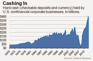
Graph(s) of the week: Companies' cash holdings

Image
According to numerous reports, it seems that the biggest world companies are sitting on record levels of cash holdings. If this is true, the question is why aren't they spending it? According to Financial Times , in 2008 the biggest 1000 world companies held a total of $1.95tn in cash, however by the end of 2012 this level has jumped up to $3.2tn. This can be attributed solely to the credit slump and the consequential severe lack of confidence during the entire recovery period.  However in 2013 the cash reserves kept on rising despite a rebound in the stock market and rising business confidence with still very low interest rates. All this should have encouraged more spending and investing from the business side, but cash reserves just kept on rising.  Source: WSJ and US Federal Reserve  Source: The Telegraph However, it is obvious the distribution of these funds are uneven. The very fact that only the top companies are holding all this cash is bi...

Assessing Abenomics

Image
Japan has been such a perplexing country in terms of its economy for the past two decades. A country riven by a slow, government-driven recovery has tried everything: from massive monetary stimuli which has kept interest rates really low for the entire period, to massive fiscal stimuli which resulted in a >230% of Japanese debt to GDP (which is ok apparently since the majority of this debt is held by domestic entities - or is it? ). It's hard to think of any country going through the same painful experience. Up until today that is. It seems that a similar scenario awaits the UK and Europe - stagnant economies at least for a decade if not longer, with rising debt levels and low productivity.  However 20 years of no growth (the two lost decades) have finally taken its tolls and the idea was to replace them with something new and yet untried, so to speak. Abenomics , the set of economic policy measures applied by Japanese PM Shinzo Abe , appears to be just what the country n...

Graph of the week: beware of stock market charts

Image
Observe the following two graphs (HT: Business Insider ): Source: Business Insider The first one depicts the S&P 500 index over the past 17 years where it seems to show remarkable patterns of volatility. The pattern is basically a series of sharp increases followed by a an even steeper decline. The market went up during the dot-com bubble in the 90-ies, only to see a sharp decline when the bubble burst (the 9-11 attacks didn't help either). The Fed then lowered the rates in fear of another recession and was encouraged to help fuel the housing bubble to offset this temporary market decline. Which it did as the market again underwent several years of high returns (which was actually another bubble). Then came the crisis of 08 and the market plummeted, only to recover in the later years, primarily thanks to massive QE done by the Fed . So if the pattern continues, we could be in for another correction right about now? Right? Wrong. Even by looking at this graph alone...

Where do YOU think Ukraine is?

Image
From Washington Post  comes a very disturbing piece of information (HT:  Business Insider ). A couple of political scientists from Dartmouth, Harvard and Princeton did a survey of 2066 Americans (sampled in a usual way) and asked them what action they wanted the US to do in Ukraine. In addition, they've asked them to locate Ukraine on the map:  "We wanted to see where Americans think Ukraine is and to learn if this knowledge (or lack thereof) is related to their foreign policy views. We found that only one out of six Americans can find Ukraine on a map, and that this lack of knowledge is related to preferences: The farther their guesses were from Ukraine’s actual location, the more they wanted the U.S. to intervene with military force." Correlation doesn't imply causality, of course. However there is something to this - more ignorance implies further ignorance. I guess military interventions in Iraq can be justified the same way?   But anyway, what surpri...

When states don't perform

One of the essential roles of the modern state is to solve market failures, i.e. provide goods on the market for which the demand is high, but the supply is inadequate. Or in other words provide goods and services when the markets for such goods don't exist (at least not enough to satisfy the demand), when the selection is adverse (e.g. health insurance market), when there is a lack information (e.g. used car market), or when there is a lack of competition (e.g. monopolies - even though we are aware that monopolies can only exist with the consent of the government). In some of these cases we can indeed find market solutions (reputation in case of asymmetric information - "fool me once, shame on you, fool me twice, shame on me" , or venture capital funds to solve the adverse selection problem on the financial markets in loans to small businesses), however in certain cases we do need the government to at least provide the basic infrastructure. In the past governments bui...