How to forecast elections? (and be good at it too)
Back in October and November I was a part of a three man academic team with a job to do some forecasting for the general election in Croatia that was held in November 2015. We were hired by the largest domestic daily newspaper, Jutarnji list, and were given an opportunity to introduce, for the first time in this part of Europe, a prediction model of general elections which simultaneously uses election polls, previous election results, and a range of socio-economic data for a given electoral district. So something similar to what Nate Silver does.
All three of us are academics, but in different fields. Prof Dejan Vinkovic, PhD is a physicist with a postdoc from the IAS in Princeton, Prof Mile Sikic, PhD is a computer scientist and bioinformatician from FER in Zagreb and A*STAR in Singapore, and finally, myself, a political economist. See some of our findings in greater detail on our new webpage: Oraclum.
The forecasting model
Before we begin, a quick note: Croatia has a proportional electoral system (PR), divided into a total of 10 electoral districts, each electing 14 members of parliament. The votes are calculated into seats using the D’Hondt method for each party that passes the 5% threshold in a given district.
We built our forecasting model in several phases. First we separated the predictions for the two main coalitions (one led by the conservative HDZ and the other by the social-democrat SDP) from the predictions for the smaller parties. We did this primarily because of the volatility in votes the smaller parties receive and due the fact that in these elections there were a total of ten new parties competing, with at least five having realistic chances to enter Parliament.
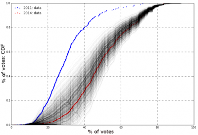
The most important part of the analysis was to capture the swing of votes between the two main coalitions between the last parliamentary elections in 2011, where SDP won by a landslide, and the elections for EU parliament held in 2014, when the trend has turned in favor of HDZ. We placed a greater weight on the more recent elections. We made a distribution of votes for HDZ and SDP on the polling station level, which we adjusted towards a smaller or greater share of total votes given the socio-economic trends. In particular we used data on local level unemployment, exposure of the community to the 1991-1995 war for independence, and the educational structure of voters in each electoral district (these three factors carry the greatest weight in predicting voting patterns of domestic voters - see my paper with Josip Glaurdic for more). Finally we included all the relevant recent polls adjusted for their partisan bias. Once we defined the main parameters of the model we ran a thousand random Monte Carlo simulations for each party for each electoral district (see Figure 1). Each scenario was randomly deviating from the pre-determined parameters which enabled us to calculate the standard deviation for each party.
 |
| Figure 1. An example of 1000 voting scenarios for one party within a single electoral district. The graph show cumulative distribution of voting percentages at the level of polling stations. |
Finally, after we performed Monte Carlo simulations to see how the votes might be distributed within the electoral districts, we used this to calculate the probability of each party earning some number of seats. This means that we were not only looking at different scenarios involving the two main parties, but a whole number of combinations where the distribution of votes for the smaller parties was also taken into account with the D’Hondt method.
Measuring our precision
The table below shows how precise we were in each electoral district. The first table depicts the probabilities of the actual event occurring. For example, the probability for HDZ’s electoral result in the first district (I) where they got only 4 seats was a mere 0.7%. It was thus hard to predict the scope of their failure in this district. On the other hand the probability for SDP’s electoral result was usually the highest probability for each district, except the last two. In general, the prediction for SDP was very precise (within two seats), while the prediction for HDZ was overshooting in most districts. The reason was the abrupt and unexpected rise of the third party – MOST – founded only a few months before the elections which emerged as a complete dark horse and took a total of 19 seats out of 140. None of the polls were able to predict the rise of MOST, so it was therefore a typical fat tail (black swan) event (for some districts the probability of them getting a few seats was as low as a 1 in 10,000). Read Nassim Taleb's Black Swan or David Hand's Improbability Principle to understand why these things happen.
 |
| Table 1. Probabilities of the actual event occurring for each party across all districts. (click to enlarge) |
In the set of tables below we show the probability distribution for each party in every district. The red box represents the actual electoral result (in seats - see first row) for each party and its corresponding probability, the dark grey is the highest probability predicted by the model that the party would get, while the light grey color is the lowest. Some parties are not shown in each district as they were only running in one or two districts (local parties like IDS, HDSSB, or REFORM).
 |
| Table 2. Probability distribution for each party across all electoral districts. (click to enlarge) |
 |
| Figure 2. Comparison of our Facebook poll results and the actual election results for the first three parties |


Comments
Post a Comment