Is there a new employment-population curve in the US?
The monthly unemployment report for the US came out today from the Bureau of Labour Statistics. Here's a summary from the NYT:
However, should we be looking at the curve from a different angle? Let's assume that the 2008 shock was a structural shock that finally changed the demand for certain jobs and certain industries in the US (following years of avoiding to deal with the new trends). If this is true then the trend of the E-P ratio curve is as expected, since the market is now in the process of long-term adjustment to the new structural trends in the economy. If this is true, then we shouldn't anymore compare the pre-shock E-P ratio with the post-shock E-P ratio. Furthermore we should stop worrying when our economy will come back to its pre-crisis trend (employment or GDP). It won't. Particularly if we accept the premise that the 2008 shock wasn't a typical AD shock that happens every now and then.
America’s employers added 162,000 jobs in July, fewer than expected, as the unemployment rate ticked down to 7.4 percent.
The job gains reported by the Labor Department on Friday, were concentrated in retail, food services, financial activities and wholesale trade. The manufacturing sector gained 6,000 jobs; government employment stayed basically flat.
While July represented the 34th straight month of job creation, the relatively strong employment gains were still not on track to absorb the backlog of unemployed workers anytime soon. At the recent pace of job growth, it would take about seven years to close the so-called jobs gap left by the recession, according to the Hamilton Project at the Brookings Institution.
We have yet to see how the Federal Reserve will react according with their QE infinity program, since the job growth is positive (almost double than a year ago), however still slightly below expectations.
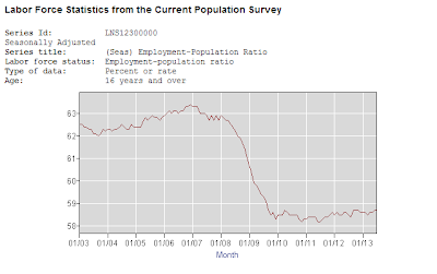
As always, due to the potential bias from the usual way unemployment data gets reported, I look at the employment-population ratio, trying to find real signals of recovery.
 |
| Source: BLS |
Unfortunately, the E-P ratio curve is still flat. As it has been for the past three and a half years, averaging around 58.5 percent, down by around 5 percentage points since the 63.3 percent peak in early 2007.
The employment-population ratio is, in my opinion, a better estimator of labour market strength than the usual unemployment rate, as it includes all discouraged workers into the equation - an issue that became rather important during the current crisis, where a lot of people simply decided to stay out of the labour market due to poor conditions. This significant drop (which we can see in the graph from the beginning of 2008 to the end of 2009) still hasn't been reversed, meaning that even though some of the people who lost jobs in the crash got them back, others (e.g. new entries) are still reluctant to entering the market. There is also a matter of many elderly workers choosing early retirement, in addition to many old inefficient jobs being lost, while the process of rediscovering new skills and specialization patterns is rather slow. Which is why the curve remains flat. Hence this provides the best piece of evidence to stimuli advocates that their methods haven't really worked.
However, should we be looking at the curve from a different angle? Let's assume that the 2008 shock was a structural shock that finally changed the demand for certain jobs and certain industries in the US (following years of avoiding to deal with the new trends). If this is true then the trend of the E-P ratio curve is as expected, since the market is now in the process of long-term adjustment to the new structural trends in the economy. If this is true, then we shouldn't anymore compare the pre-shock E-P ratio with the post-shock E-P ratio. Furthermore we should stop worrying when our economy will come back to its pre-crisis trend (employment or GDP). It won't. Particularly if we accept the premise that the 2008 shock wasn't a typical AD shock that happens every now and then.
The new E-P curve then looks something like this (drawn from January 2010 to July 2013):
 |
| Source: BLS data |
And it does seem to show some positive signs of a recovery in the past few months, even though the trend is still inconclusive. As long as the process of re-specialization doesn't get prevented by various interest groups seeking political protection, the trend in the labour market will turn positive. Both in the US and in Europe, which has yet to arrive at this stage of progress.


The Fed is trying to find a way out of the QE without wrecking the economy. They are riding a tiger. As for the empoyment figures they are not even keeping pace with population growth. We are in a great stagnation caused by all the uncertainty from government actions.
ReplyDelete