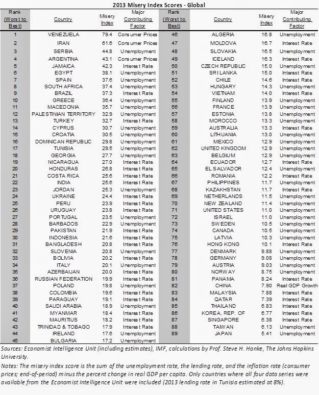
Graph of the week: The misery index
Recently I came across a new interesting index of economic development measuring the opposite of the usual wealth, prosperity, happiness and income p/c. This one ranks countries in reverse order, it measures their relative "misery" with respect to their unemployment situation, inflation and bank lending - so all the stuff that makes people poor and hence miserable.
Steve Hanke of the Cato Institute and John Hopkins University, used the data from the Economist Intelligence Unit ranking 89 countries. He applies a very simple methodology: sum of inflation, bank lending and unemployment rates minus year-by-year per capita GDP growth (so as to offset the temporary negative effects of the former variables). He got the intuition from Arthur Okun and Robert Barro who used things like inflation, unemployment and government bond yields to measure relative misery levels in the US during different Presidential administrations.
The first apparent criticism to such an approach is relatively scarce usage of variables to put into the index. Furthermore these are all aggregate and very broad macroeconomic categories, which can send a signal of how the country is doing but fail to distinguish for other institutional characteristics of countries that do make a huge difference with respect to how the adverse event hits the population. For example, losing a job in Spain, Portugal or Greece is arguably not the same as losing a job in Iran or Venezuela. The macro category of high unemployment tells you nothing of the state or the flexibility of the labor market (btw, recall that unemployment rate isn't even the most precise indicator of the labor market) nor does it say anything about the unemployment compensation the unemployed receive. This factor alone biases many countries upwards on the list.
Perhaps he could have included more stuff (such as what the Legatum's Prosperity Index uses) and weight them all differently, but for the sake of argument let's call it a decent indicator as it does seem to capture the relative levels of temporary misery in many countries. Even if we accept the argument that the aforementioned European countries may be more stable than non-European ones, it's still hard to dispute the fact that many people in these countries feel very miserable at the moment. Finally, taking a glimpse over the index rankings, it does seem to paint a pretty similar picture as many other indexes out there, except in this case the scale is reversed (what's up is bad, what's down is good).
However by looking at it in greater detail, you can spot some of the apparent biases - like the zero inflation biasing Japan downwards, or the fact that Scandinavian countries (which usually top all the prosperity and happiness based indicators) tend to be quite far from the bottom (and bottom is good here), probably due to unemployment biasing them upwards. And this isn't really realistic. Are the people in China, Malaysia, Panama or Thailand really less miserable than their Scandinavian and Western Europe counter-parts? I doubt it. In these cases the high growth rates of some Asian countries bias them downwards on the index.
All in all, an interesting indicator, but not really too precise in actually measuring the people's relative misery. In any case I would rather refer to the Economic Freedom Index or the Legatum Prosperity index.


Maybe it would be better with a humbler approach that focuses on "clubs" - similar countries by some criteria. But I don't really see the point of the index. Hanke has done interesting work by using asset market prices and black market-official exchange rates to better estimate inflation at places where such data is manipulated or unavailable. Think its called the fail currency project, most interesting country is definitely Argentina, but it has more problems than just a failed currency.
ReplyDeleteGreets!
Agreed. His idea was to follow upon similar indices made by Okun and Barro for US presidents - to evaluate their performance by using macro data (a standard approach of the rational opportunistic political business cycle model). And even though it does make sense to use such data to compare presidents within countries, the cross-country comparison is much more sensitive
Delete