Posts

Showing posts from January, 2012

Apple and the economy: why the West is switching to services?

Image
Last Sunday the New York Times presented a report on " How the US lost out on iPhone work " calling on the phenomenon of the disappearing middle class , claiming that even though Apple is a hugely successful company, its success reaps more benefits abroad than domestically, at least when observing the figures behind job creation. Apparently, in addition to providing excellent customer value and service, Apple is supposed to rebuild the US manufacturing industry, by shifting its factories back to the US and create more domestic jobs to help kick-start the current sluggish recovery.  Why are they helping China, when the US is high in unemployment? Why aren’t they creating jobs here in the US, ask the NYT reporters. And yet they list an impressive list of reasons why Apple still shouldn’t be doing so. The first one is speed and flexibility, the second is scale of production and size of population, the third is cost of both labour and inventory, which are all impossibl...

Graph of the week: Italian M3

Image
Here’s a graph I picked up from Tyler Cowen last week, which he found on the Telegraph blog . Here’s the original source - the report from Banca d'Italia (the report is in Italian), pg. 7: Banca d'Italia: Supplements to the Statistical Bulletin , 2012 The graph is entitled 'Italian contribution to monetary aggregates of the euro area' (percentage change over 12 months). It is showing a significant downturn of Italy's monetary growth. In addition its GDP is predicted to fall for a further 1.5% this year, which is not surprising as the entire scenario reminds me of the Friedman and Schwartz  argument on the reasons behind the Great Depression in the US.  Friedman and Schwartz identified a series of errors made by the Federal Reserve in the late 1920s and early 1930s. Each of these mistakes led to an undesirable tightening of monetary policy and ultimately led to declines in the money supply which could be accounted for the drops in prices and output th...

How charities and religion (should) solve the problem of social spending

Image
Note: This post was also published at the Adam Smith Institute blog .  A few weeks ago I noticed an inequality index I wasn't aware of before. It is a report called the  World Giving Index , published annually by the Charities Aid Foundation . The aim of the report is to show which countries are most likely to give donations to charities and therefore, which nations are most open to a privately offered system of fighting poverty. It is done by a set of surveys that ask citizens worldwide whether they have in the last month donated money to charity, volunteered or helped a stranger in any way. One would expect that the outcome would see countries with strong welfare states topping the list, as they have a much better sense of social capital developed than the 'ruthless' US, where self-interest and greed allegedly drive the incentives of individuals.  Well, surprisingly, or not surprisingly at all, the US tops the list, followed by other Ang...

Percentages and inequality: graph of the week

Image
I will finish the discussion over inequality with the graph I picked up from Greg Mankiw   (it’s not intellectual property theft if I cite my sources, right?): The graph shows that the US clearly has a progressive tax system , accounting for all federal taxes, not just income taxes, meaning that the burden on the rich is much higher than what some are trying to claim. In fact, during last week, there has been an interesting quarrel in the blogosphere that started with Paul Krugman writing a post on low taxes paid by the rich, using a left wing think tank as his source. However, the graph as well as the entire report, failed to include corporate taxes which put a disproportionaly higher burden on the rich, thereby biasing the conclusions.  The mistake was quickly noticed among economists resulting with Krugman admitting his mistake , but still taking a hit on his critics. There’s a good summary of the whole quarrel by Steve Landsburg . On a diff...

Percentages and inequality: where is the middle class?

Image
In the last post I brought to attention the inequality issue and have presented a different approach on the 1% debate. Today’s post will be a follow up on inequality, the alleged disappearance of the middle class and the forgotten ideas of innovation and progress that drive the economy forward. Apparently, there is no more middle class in America . What has once been the proud distinction of the nation is now split up between the rich and the super rich on one side (I can’t track the percentages of who’s who anymore) and everyone else, or the poor on the other side. However this data, just as the data on the top 1%, can be misleading. The middle class hasn't disappeared. One needs to be careful with the data on income measurements. There is a huge possibility of bias as the levels of income are taken from reported income tax data. This means that making inter-country comparisons can be futile as countries (1) don’t have the same statistical standards, and (2) some countries exp...

Percentages and inequality: who is the top 1%?

Image
This week the focus of the blog will be on the rising issue of inequality. Firstly I aim to demystify the rant over the 1% of the rich and their tax burden, after which I will carry on about inequality in general and why is it such an important issue to understand.  Top 1% (or 0.1%, or 0.01%?) I didn’t give much attention to the Occupy ‘99%’ movement, but I feel I ought to. I still don’t see the point in trying to explain to them the errors of socialism and how their movement is paradoxically a call for decentralization, not collectivism, but I will touch upon some of the arguments in the whole inequality debate. What surprises me the most is the hostility created towards the richest 1% of Americans (or Britons) under the populist notion that they made money from everyone else in the crisis, making them more rich than before whilst making everyone else poorer. What needs to be clarified is who are the 1% in America. According to the claims of the...

Graph of the week

Image
This week I look at the Heritage 2012 Index of Economic Freedom . (click on the graph to get a better view) Source: 2012 Index of Economic Freedom , Heritage Foundation and The Wall Street Journal The current index shows an apparent worldwide decrease in business freedom and government spending, for obvious reasons. Ever since the start of the financial crisis, the total World average has decreased from 60.3 to 57.9, mostly due to the growing levels of government spending, rising accumulation of debt, unsustainable fiscal deficits of more and more countries and rising constraints in banking and business regulation.  The traditionally low average scores are still investment freedom, financial freedom and in particular freedom from corruption. The problem of corruption is what is making all the dark red and orange countries remain in relatively unfree or repressed regimes. The 'heat map' in Europe shows particularly worrying signs wh...

Crony capitalism and the financial crisis

Image
I will start this post with a video from the Economic Freedom webpage... ...and a definition of the term cronyism taken from the same source: "Cronyism occurs when an individual or organization colludes with government officials to get forced benefits they could not have otherwise obtained voluntarily. Those benefits come at the expense of consumers, taxpayers, and everyone working hard to compete in the marketplace." My paper on the financial crisis published last year included a chapter on the rising political power and lobbying of the financial sector to explain their enormous accumulation of power and their interconnection with government officials.   The summary of the paper is presented on the blog page , where the mentioned chapter has been left out. The causes of the subprime crisis, the housing boom and bust, its contagion on finance and the real sector and consequently onto the welfare states of Europe, are many. The cronyism of the capitalist system in t...

The Eastern approach

Image
I stumbled upon a great blog post today from a Hungarian business owner on the prospects of starting a business in Hungary. He entitles it pretty clearly  "This is why I don't give you a job" . He points out to the devastating effects of the Hungarian system where business start ups are almost impossible, if you don't have political support that is. He describes the anti-capitalist mentality and systemic problems with corruption as the highest obstacles to creating and maintaining a stable business. From the variety of comments the text got I understand that many businessmen in Hungary share his concerns as some of them were forced to simply close down. I recommend you read the full text to get the clear picture. The text itself contains some rough language, but while reading it I understand why the author decided to use it. There are simply no better words to describe the awful situation in the Hungarian private sector. The administrative, regu...

Understanding unemployment

Image
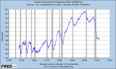
Today's reports on the decrease of US unemployment to 8.5% and an increase in nonfarm payroll s by 200,000 in December 2011, resulted in an expected increase of optimism among economists and investors. Every job creation is most welcomed, particularly since increasing job creation is a sign of a positive direction of the economy. It is expected as the recovery paces up, uncertainty will decrease and confidence will increase, making the firms invest more and eventually hire more. More jobs being created will further stimulate the positive feedback loop as more people will have stable incomes, anticipate a more certain future stream of income and will spend more thereby increasing the aggregate demand. So if we see positive signs of job creation one could conclude that we are half way there to achieving a complete recovery? Not quite. I don't mean to be too pessimistic, but I would like to draw attention to the article by Dan Mitchell of the Cato Institute : If the unem...

Graph of the week

Image
The graph of the week section continues with comparing the current recovery with the fastest, the average and the slowest recovery so far.  Source: Wall Street Journal, Real Time Economics Blog So far the current recovery is not doing so well. In comparison over 9 categories, the current recovery appears to be slower than the average (in some categories significantly slower than the average). In general it isn't the slowest recovery so far, but it is dangerously close to being one (especially since the comparison is drawn over a set of recoveries - this means that some inconsistencies may arise in comparing each of the previous ones with the current one).  The rate of new jobs being created (total jobs and manufacturing) is particularly low (0.4% and -0.3%), just as the housing prices (which are still falling, -8.8%), but they're both just above the slowest recovery levels.  The worst points of the current recovery are disposable personal income, which...

Lack of money, lack of confidence, lack of growth

Image
Problems facing small and medium sized businesses The highest burden for businesses recently has been the lack of money, to put it simply. Illiquidity is rising worldwide and more and more private sector businesses are unable to service their liabilities. Late payments are forcing many small businesses to invest less and lay off more. The inability to anticipate future income or payment for a good or service is rendering the businesses with apathy and a severe loss of confidence. No firm is comfortable enough to make credible plans of new investments and business growth in a complex array of uncertainty . And who could blame them? Consumers feel the same way. With the uncertainty of whether they will find or hold on to a job they postpone major spending decisions. Even in Christmas time, shopping sprees are lighter than before (although still big enough to satisfy the compulsory gift-giving demand). People are reluctant to put on more debt and take on more loans and often discourage...

New Year’s Resolutions

Happy New 2012 to all! I’ll start us off with the New Year’s resolutions to be expected from the blog and some suggestions that should be followed by the policymakers. It’s mostly a recap of the ideas presented in the blog so far. If it reaches at least one civil servant, I’ll call it a success. Let’s begin with the new ideas for the blog itself: All new blog posts will be accompanied by a figure or a picture in order to approach the reader from a more amusing perspective. It is aimed to make the blog more ‘user friendly’ in a sense that it will provide visual stimulus and witty or intriguing links and immediate conceptual understanding of what the post is about. I won’t change the design of the blog though, I like it this way. Perhaps in time when I get bored with the current outlay. Apart from that I plan to introduce a new page presenting business cycle tracking. I will track the data that recognizes business cycle movements which I feel could be particularly useful in the fol...