Graph(s) of the week: comparing US Presidential performance

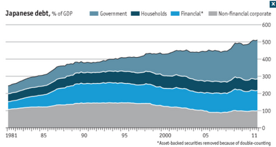
Relating to a graph of the week from two weeks ago, I again turn to the Economist and its interactive feature comparing the performance of past elected Presidents in their failed or successful re-election bids. What is really interesting is that President Obama seems to, on average, have much worse economic results than most other Presidents who failed to be re-elected, particularly in the disposable income category (third graph). The other two categories (GDP and unemployment) also look disturbing, where Obama's current performance is worse than an average failed re-election bid. Having all this in mind, it's interesting to see how a lot of economists still think he's the right man for the job (at least according to the partially biased survey described in an earlier post ). It is true that the President found himself in the middle of a huge wealth shock to the public and is facing massive develeraging (see second graph ) for the whole economy. Ther...


