Tracking the recovery (3) - USA
"Tracking the recovery" section continues in its third edition from the start of the blog. The first version was done in February last year (featuring final data for January or December), while the second version was done by the end of July, beginning of August (featuring final data for May and June). Things were in much turmoil at the time, with severe confidence and uncertainty problems in the beginning of the year following the panic of November 2011, and significant volatility of confidence in the months to come following events such as Greece elections, Spanish bank bailout and other exogenous shocks. Notice that the pattern has more or less continued, except now the most recent exogenous shocks were Italian elections and the Cyprus bailout. The effects of these events on confidence will be seen later in the year, probably in the September edition of the Tracking the Recovery section.
In the first version back in February 2012, I presented an overview of business cycle indicators and valuable sources useful to familiarizing oneself with the business cycle theory. I advise the current readers to take a look, simply to get a better idea of the difference between leading, coincident and lagging indicators, and why and where economists use them. The indicators I observe here aren’t necessarily the best ones, but they do have a certain reputation for precision and robustness.
As was the case before, I start with the United States (for which there is a wide range of data available) while the next two posts will be concerning Europe and business and consumer confidence.
United States
Starting where we left off in July, the second half of 2012 was mixed for the US economy. After a 3.1% growth in Q3, the economy stagnated in Q4 growing at only 0.4% (BEA data). The reason was most likely the uncertainty regarding the fiscal cliff by the end of the year. The BEA also mentions are falling inventories, resulting from downturns in inventory investment in manufacturing industries and wholesale trade, declining exports, and a fall in federal spending on defense. In total, growth in 2012 was 2.2%, which is an improvement from 1.8% in 2011, however according to many still not enough for a robust recovery, and still way below the pre-crisis potential output. In light of this, I have read a couple of interesting findings of how the US potential output is actually much lower then perceived, so that the recovery isn't all that bad (I plan to write a separate blog on this topic).
Let's review some of the leading indicators to assess the US recovery.
Let's review some of the leading indicators to assess the US recovery.
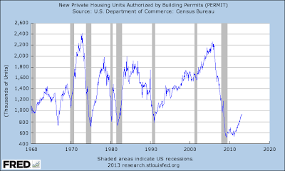
New housing building permits (a good leading indicator, as it provides insight into upcoming activities in housing construction and economic activity - induced in LEI)
 |
| Source: St.Louis Fed, FRED |
The housing market is according to this indicator pointing to a decent recovery, and it could be a good explanation for some of the positive growth figures we saw in the past. I've wrote about this back in December when Goldman Sachs predicted the recovery using the graph on private savings and government deficits, and emphasized how the recovery in residential investments is supposed to be the driver of future growth. According to the housing permits leading indicator, it could be inferred that US growth will pick up and once again housing will be its driver.
New orders in manufacturing: New orders in durable goods (maybe not so precise as a leading indicator for recessions, but may signal a potential recovery, although the indicator can be biased due to volatility in the transportation sector or defense which can drive monthly figures unexpectedly) - depicted in the upper left on the figure below (click to enlarge):
As we can see most of the manufacturing orders indicators are improving, particularly in the beginning of 2013, following the passing of the temporary confidence blow due to the potential fiscal cliff crisis. The fiscal cliff threat still hasn't entirely passed, but so far at least in manufacturing businesses are showing positive signs of improved confidence and more spending and investment. Adding this picture with the one on the housing market, this set of leading indicators is showing significantly positive signals. However, this is still fragile and can be easily reversed following some temporary shock to the economy. Also, one should have in mind that these indicators only predict short-run future economic activity, and are bad at figuring out a structural problem to the economy, which the US certainly has.
Fixed domestic investment (a powerful leading indicator that can drive aggregate demand; it falls faster during a recession and grows faster during a recovery than the GDP) - depicted in the upper left corner of the figure (click to enlarge):
Fixed domestic investment is consisted of non-residential (lower right) and residential fixed investment (lower left), where both seem to reaffirming the trend they had 6 months ago: a careful recovery in the residential category (for the first time showing a slight increase in trend) and a continued recovery of the non-residential investments. On the upper right graph I show the total business inventories as the only indicator that has reached its pre-crisis trend line of growth. This is a tough indicator to understand and explain, primarily since it's hard to tell whether an increase is due to higher expected future demand or pilling up stock due to overestimated demand. According to the rest of the indicators, the former might be the case (6 months ago, I made the opposite conclusion).
Employment - population ratio: The first time I used an actual leading indicator - unemployment insurance claims - however, the increasing trend of people leaving the labour force made me switch last time to a much more precise and unbiased indicator.
And its showing still no sign of recovery on the US labour market. A lot of people are still out of the labour force and most likely will stay there until we see some improvement in business investment and private sector activity. Another explanation could be that this is the new "normal" for the US labour market, as many elder workers chose early retirement, but weren't replaced by enough new workers; there weren't as many, which is why the labour participation rate is lower. This is one of the arguments for lower than usually estimated US potential output: an ageing workforce. To this I would add a natural transition due to many old jobs being lost and new jobs that are yet to come (and would come much faster if it wasn't for the multitude of constraints preventing the re-specialization in jobs and skills).
Finally, here is a joint, weighted-averaged US Leading economic index (LEI).
And it's the only indicator predicting a slowdown in the coming months. This is surprising after looking at most of the indicators that usually consist the LEI, and particularly with respect from the LEI measured by the Conference Board, which is showing an entirely different pattern:
Verdict: The uncertainty that was looming 6 months ago seems to be over for now. The fiscal cliff conundrum has passed without major casualties (for now), but fear is still present among businesses and investors, even though things seem to be going back to normal. As I've already mentioned, we need to keep in mind that these set of indicators can only point to a short-run recovery, and cannot foretell possible risks of outside shocks (these aren't stress tests) nor can point out to the underlying structural problems of the US economy. If more attention was divided into overcoming the US structural issues, even the short-run indicators would look more strongly than they are now.


I have seen nothing to contradict my original prediction, which is that we would have modest recovery for the first part of 2013. Followed by a recessionary dip in the last part of the year.
ReplyDeleteI base this on Fed policy which has no remaining tool except to rack up endless debt. And upon the realization by the end of the year that no one will be able to afford the Affordable Health Care (Obamacare)Act.
Does the "housing" indicator take only private houses or all the housing investment (not done by the public sector)? I was watching an interview on bloomberg few days back. The guest was showing how the real recovery is in multifamily houses and the rentals.
ReplyDeleteAlso permits can be tricky sometimes since in some states "green" lobbying and other laws seriously affect the supply, and "they" dont really care which part of the cycle. Maybe the rebound in prices wouldn't be a bad indicator, especially since homeownership is still in pretty low point. (Don't take much of consideration in this, Im just "thinking out loud")
Other than that, Im more optimistic than Kyle about US going forward in 2013. I saw interview with a DB analyst on US and they seem pretty optimistic as well, maybe too much though, Im still not convinced Bernanke insulated US from the close-to-SHTF moments in Europe. He might still get some help from BoJ. The long term growth prospects are worrisome. I think the immigration reform, if done well could be a good impulse.
Greets
The housing permits indicator only looks at private housing, so it excludes the possible bias of green lobbying for example, which is a good observation btw. Also, it measures total units of permits issued, and doesn't imply an increase in prices (the prices are increasing, but are not shown in that indicator).
DeleteAs for the long term outlook I agree, an immigration reform would be a good impulse. I was meaning to write something about that in the coming weeks.